School District Level Segregation
In the last post we talked a bit about segregation and I showed how to calculate segregation across Oregon using census tracts to estimate segregation levels in counties. In this post, we’ll do a similar sort of thing, but we’ll look at the segregation of school districts in Oregon by exploring the distribution of demographics across schools within the district. Like last time, we’ll stick with only using the dissimilarity index because (a) it’s generally a useful and interpretable metric, (b) it’s probably the most widely used segregation indicator, even if it does have limitations, and most importantly (c) it’s easy to calculate and I’d like the focus of this post to be more on the data, rather than different methods for calculating segregation. In a later post, I’ll do the same sort of thing I’m doing here, but will use a few different methods so we get a more complete picture of the segregation in the given area.
Getting school district boundaries
We don’t actually have to have school district boundaries to calculate segregation, but they are helpful if, in particular, we want to visualize the segregation. There’s a couple of way to get school district boundaries, but the best from my perspective is the new {leaidir} package from Isabella Velásquez. You can install this package in R with
remotes::install_github("ivelasq/leaidr")Then we can download shape files for all school districts across the entire United States with
library(leaidr)
lea_get(here::here("shape-files"))
Note that this will take a minute or two because you’re downloading a relatively large file.
Now we load just the shape file we want, which in this case would, of course, be for Oregon. We have to refer to Oregon through it’s fips code, which for Oregon is 41 (see a complete list here).
or <- lea_prep(here::here("shape-files"), fips = 41)## OGR data source with driver: ESRI Shapefile
## Source: "/Users/daniel/BRT/dsi-seedgrant/website_k-entry/shape-files/schooldistrict_sy1819_tl19.shp", layer: "schooldistrict_sy1819_tl19"
## with 13315 features
## It has 18 fieldsThis is a SpatialPolygonsDataFrame object, but I prefer using simple features via the {sf} package, so I’ll convert it.
library(sf)
or <- or %>%
  st_as_sf()
And now let’s take a quick look at the boundaries.
library(tidyverse)
theme_set(theme_minimal(15) +
            theme(legend.position = "bottom",
                  legend.key.width = unit(1, "cm")))

ggplot(or) +
  geom_sf(fill = "#a9c7ef")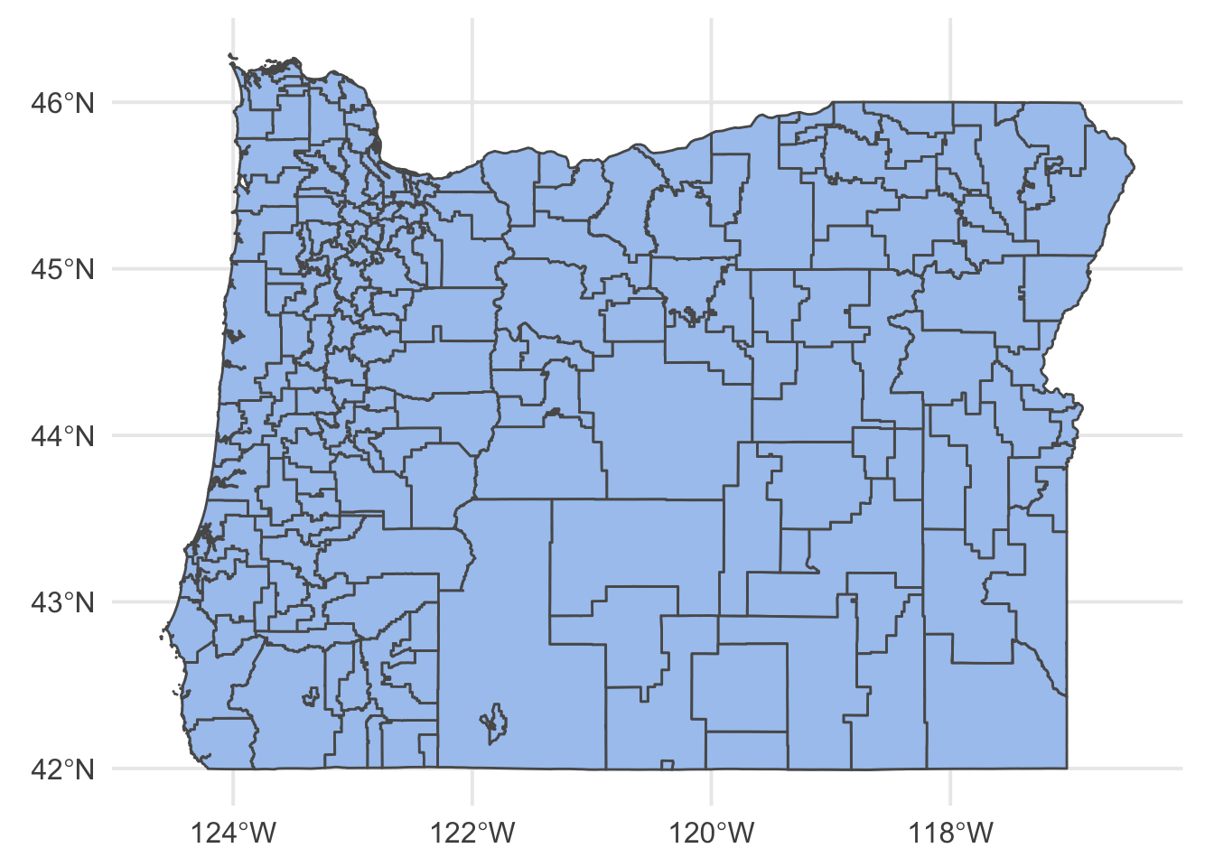
Wonderful! Note that this is considerably better than what you might get with, say tigris::school_districts which, for Oregon anyway, ends up with some missing data and empty polygons.
Getting enrollment data
Let’s calculate how economically segregated districts in Oregon are. We’ll do this by comparing, essentially, the proportion of economically disadvantaged students in a given school to the overall proportion in the district. In other words, if 40% of all students in a given school district are classified as economically disadvantaged, then we would expect roughly 40% of the students in each school to be classified as such. If, however, some schools have 90% classified as economically disadvantaged, while others have 10%, then we would conclude this district has at least some degree of economic segregation.
First, let’s get the data we need. We’ll use data from the larger kindergarten-entry project. Each of these files were obtained originally from the NCES Common Core of Data.
school_lunch_elig <- read_csv("https://github.com/OR-K-Entry/k-entry/raw/master/data/nces/intermediary/schools_lunch.csv") %>%
  filter(school_year == "2017-2018") %>%
  select(ncessch, leaid, frl)

school_mem <- read_csv("https://github.com/OR-K-Entry/k-entry/raw/master/data/nces/intermediary/schools_mem.csv") %>%
  filter(school_year == "2017-2018") %>%
  select(ncessch, total) %>%
  distinct()

# Join and remove overall statewide data
d <- left_join(school_mem, school_lunch_elig) %>%
  filter(leaid != 4100009) %>%
  select(leaid, ncessch, frl, total)
d
## # A tibble: 1,244 x 4
## leaid ncessch frl total
## <dbl> <dbl> <dbl> <dbl>
## 1 4100003 410000301061 91 130
## 2 4100003 410000301062 41 77
## 3 4100014 410001400748 265 416
## 4 4100014 410001400754 58 97
## 5 4100014 410001400761 153 281
## 6 4100014 410001401026 60 100
## 7 4100015 410001500821 358 425
## 8 4100015 410001500831 191 237
## 9 4100015 410001500853 222 308
## 10 4100015 410001501588 26 36
## # … with 1,234 more rowsAnd we’re good to go!
Calculating dissimilarity
The dissimilarity index is non-spatial, so we can actually go ahead and calculate measures of segregation for each district using just the enrollment data above. First, let’s write a function to do this. We could, of course, use a different package, but this is such a simple measure I prefer to just use my own function.
dissim <- function(ind, total) {
  if((sum(is.na(ind)) / length(ind)) >= 0.5) {
    return(NA_real_)
  }
  a <- ind / sum(ind, na.rm = TRUE)
  b <- (total - ind) / sum(total, na.rm = TRUE)

  1/2*sum(abs(a - b), na.rm = TRUE)
}
In this function, ind stands for counts of the given indicator, such as the number of students in the school receiving free or reduced price lunch. The total argument refers to the total number of students in the school. The ind argument is assumed to be a vector of counts for schools in the district, while total can be either a vector of the same length or a scalar. Please see the previous blog post for a more detailed explanation of the body of this function (and as always, feel free to get in touch if it’s still confusing).
One thing to note is that the first thing the function does is check if at least 50% of schools in the district report free or reduced price lunch (FRL) data. This is because districts in Oregon do not report FRL counts if there are fewer than 7 students in the school that receive FRL services. The 50% cutoff is arbitrary, and we might want to look at other values, but it’s just what I decided on for now. We need FRL eligibility data for at least half the schools in the district to obtain an overall district-level estimate of economic segregation.
Now, let’s calculate it for each district.
dissims <- d %>%
  group_by(leaid) %>%
  summarize(d = dissim(frl, total))
dissims
## # A tibble: 198 x 2
## leaid d
## <dbl> <dbl>
## 1 4100003 0.3188406
## 2 4100014 0.2997763
## 3 4100015 0.4084939
## 4 4100016 0.2035
## 5 4100019 0.2768065
## 6 4100020 0.2999805
## 7 4100021 0.3070539
## 8 4100023 0.2578609
## 9 4100040 0.2535497
## 10 4100043 0.4610778
## # … with 188 more rowsHooray! Which districts in Oregon are the most economically segregated, using this method?
arrange(dissims, desc(d))## # A tibble: 198 x 2
## leaid d
## <dbl> <dbl>
## 1 4108100 0.4666434
## 2 4100043 0.4610778
## 3 4110040 0.4091908
## 4 4100015 0.4084939
## 5 4109270 0.4040470
## 6 4101350 0.4022989
## 7 4111640 0.4019608
## 8 4112600 0.3994807
## 9 4107710 0.3943662
## 10 4107590 0.3937433
## # … with 188 more rowsWe can identify these districts by either merging in other data sources (e.g., this file) or using the NCES District search tool entering the leaid into the NCES DIstrict ID field. Using the latter method, we find that the top three most economically segregated districts in Oregon, according to the dissimilarity index, are Santiam Canyon School District in Linn County, Mitchell School District in Wheeler County, and ODE YCEP District, which is a district operated by the state and spans multiple counties (so it probably makes sense that this district would be more economically segregated).
Visualize the results
Now we have the numbers, what do they look like when mapped? We just need to join these data with our school district boundaries data and plot the results.
or <- or %>%
  mutate(leaid = as.numeric(as.character(GEOID))) %>%
  left_join(dissims)

reference_points <- tibble(
  city = c("Portland", "Eugene", "Medford", "Bend"),
  lat = c(45.523452, 44.052069, 42.336896, 44.058173),
  lon = c(-122.676207, -123.086754, -122.854244, -121.31531)
  )

library(colorspace)
ggplot(or) +
  geom_sf(aes(fill = d),
          size = 0.1,
          color = "gray40") +
  geom_point(aes(x = lon, y = lat), data = reference_points) +
  ggrepel::geom_label_repel(aes(x = lon, y = lat, label = city),
                           data = reference_points,
                           min.segment.length = 0) +
  scale_fill_continuous_diverging(name = "Group Representation",
                                  palette = "Green-Orange",
                                  mid = mean(or$d, na.rm = TRUE),
                                  na.value = "white")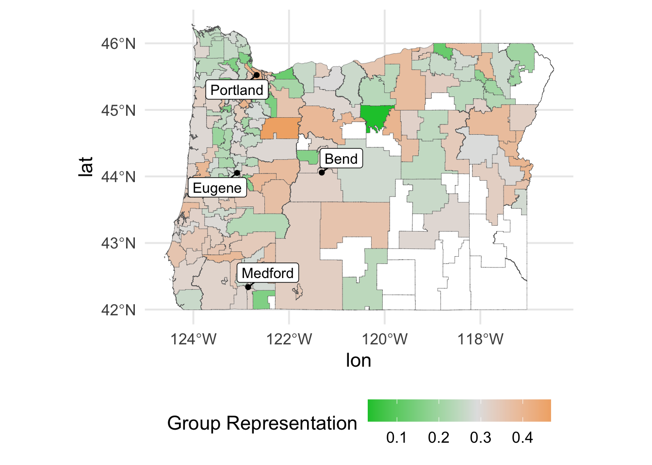
Note that I’ve used a diverging palette to highlight districts with relatively higher or lower economic segregation estimates relative to the overall sample average. It also appears essentially all of our missing data is in the Southeastern part of the state, which is not terrifically surprising given that this is the least densely populated area of Oregon. I’ve annotated the map with a few of the larger cities in Oregon. Overall, there’s surprisingly little pattern here. Perhaps changing the method we use to estimate segregation will change that somewhat, but it is sort of nice to see that, for example, areas of dense population do not necessarily have higher economic segregation rates.
That’s it for now, please get in touch if you have any questions!