Calculating segregation
Exploring spatial and non-spatial measures of dissimilarity
Racial segregation refers to the “systemic separation of people” based on their race or ethnicity. Plenty of projects have documented that American cities, in particular, are segregated to an alarming degree (for example, see this 2018 article by Aaron Williams and Armand Emamdjomeh in the Washinton Post). The segregation itself is not accidental, and is a major indicator of structrual discrimination, with the opportunities of groups of people systematically suppressed relative to others.
Segregation is often used in research when investigating large-scale social issues. For example, how do rates of obesity differ between people living in highly segregated areas from those living in more diverse areas? When investigating these differenes, however, it is critical that we consider the conditions driving the segregation, and not just the segregation itself. Generally, it is not the segregation itself that drives these differences, but rather differential opportunities between communities. Measures of segregation can be a useful indicator of structural discrimination.
A considerable number of different methods for measuring segregation exist, each built on different theories and with different strengths and weaknesses. In this post, I’ll discuss three such measures of segregation, \(d\), \(r\), and \(h\), the differences among them, and how we can calculate them in R.
Measures of segregation
Massey and Denton (1988) categorized measures of segregation into five broad categories: evenness, exposure, concentration, centralization, and clustering. These are defined as follows:
Evenness refers to how evenly two group of people are distribtued across a specific area.
Exposure refers to the “degree of potential contact, or the possibility of interaction, between minority and majority group members within geographic areas” (p. 287).
Concentration refers to the physical space occupied a given group. For example, a group that makes up 25% of a city’s population but resides in only 12% of its land mass would be said to be relatively concentrated.
Centralization is related to concentration, but specifically indexes the degree to which a given group is located near the center of urban areas.
Clustering refers to the extent to which specific groups of people are spatially clustered
In this post, we’ll focus on the dissimilarity index, which is a measure of evenness. There are two versions of this statistic, one of which accounts for the spatial distribution of points, and one that does not. After a brief explanation below, we’ll get into an applied example with R.
Dissimilarity index
Perhaps the most common measure of segregation is known as the dissimilarity index. The dissimilarity index is defined as
\[ d = \frac{1}{2}\Sigma_{i = 1}^{N}\left\lvert\frac{a_i}{A} - \frac{b_i}{B}\right\rvert \] where \(a_i\) and \(b_i\) are the population of \(A\) or \(B\), repectively, in area \(i\). More concretely, imagine we wanted to use the dissimilarity index to estimate the segregation of a county based on census tracts. In that case \(a_i\) would represent the population of our “a” group in census tract \(i\), while \(A\) would represent the overall population for the county (and similarly with \(b_i\) and \(B\)). Each census tract, \(i\), would then have a value representing whether a given group was over- or under-represented for that area. To estimate the overall segregation in the county, we would take the absolute value of all of these differences, sum them, and divide by two (halve the resulting value).
The dissimilarity index is widely used and fairly easy to interpret. It represents the proportion of people that would need to be “redistributed” for the representation to be equal. The primary drawback of the dissimilarity index is a non-spatial measure–i.e., it does not “appropriately take into account the spatial patterning of population distributions” (Reardon & O’Sullivan, 2004).
Alternatively, we can use measures that directly account for the spatial distribution, including a spatial measure of \(d\). Unlike the non-spatial index of \(d\), this measure does not represent the percentage of people that would have to relocate to obtain pure evenness, but it does provide an alternative representation of how different a local environment is from the overall environment. It’s esimtation is considerably more complex (see Reardon & O’Sullivan for a complete description) but, luckily, is easily estimable in R via the seg package in R.
An applied example
Let’s look at an applied example. First we’ll get some data. If you’d like to follow along, you’ll need to first get an API key for the US Census (see the documentation from tidycensus here). And, of course, you’ll need to have R installed on your local computer, along with each of the packages (all of which can be installed with install.packages("pkg_name")).
I’ll start by getting census tract data for Oregon on the number of people who identified as Hispanic or White. I’ll then extract the county and subset it to just lane county.
library(tidyverse)
theme_set(theme_minimal(15) +
            theme(legend.position = "bottom",
                  legend.key.width = unit(1, "cm")))
library(colorspace)
library(tidycensus)
options(tigris_class = "sf")

or_tracts <- get_acs("tract",
              variables = c(hisp = "B03002_012",
                            white = "B03002_003"),
              state = "OR",
              output = "wide",
              geometry = TRUE) %>%
  mutate(county = gsub(".+\\d,\\s(.+)\\sCounty.+", "\\1", NAME))

lane <- or_tracts %>%
  filter(county == "Lane")
This gives us a dataset that looks like this
lane## Simple feature collection with 87 features and 7 fields (with 1 geometry empty)
## geometry type: MULTIPOLYGON
## dimension: XY
## bbox: xmin: -124.1587 ymin: 43.43739 xmax: -121.7681 ymax: 44.29054
## geographic CRS: NAD83
## First 10 features:
## GEOID NAME hispE hispM whiteE
## 1 41039001002 Census Tract 10.02, Lane County, Oregon 295 144 3263
## 2 41039001804 Census Tract 18.04, Lane County, Oregon 137 94 3324
## 3 41039001902 Census Tract 19.02, Lane County, Oregon 1055 339 5242
## 4 41039002201 Census Tract 22.01, Lane County, Oregon 195 143 3254
## 5 41039000404 Census Tract 4.04, Lane County, Oregon 586 292 3217
## 6 41039000702 Census Tract 7.02, Lane County, Oregon 120 78 2245
## 7 41039000902 Census Tract 9.02, Lane County, Oregon 105 73 4523
## 8 41039001201 Census Tract 12.01, Lane County, Oregon 207 190 3096
## 9 41039003102 Census Tract 31.02, Lane County, Oregon 506 147 5108
## 10 41039003700 Census Tract 37, Lane County, Oregon 582 105 3385
## whiteM geometry county
## 1 323 MULTIPOLYGON (((-123.3196 4... Lane
## 2 243 MULTIPOLYGON (((-122.9109 4... Lane
## 3 468 MULTIPOLYGON (((-122.9855 4... Lane
## 4 332 MULTIPOLYGON (((-123.1145 4... Lane
## 5 441 MULTIPOLYGON (((-123.2487 4... Lane
## 6 247 MULTIPOLYGON (((-124.1503 4... Lane
## 7 395 MULTIPOLYGON (((-123.6256 4... Lane
## 8 405 MULTIPOLYGON (((-123.185 43... Lane
## 9 457 MULTIPOLYGON (((-123.084 44... Lane
## 10 340 MULTIPOLYGON (((-123.0865 4... Lanewhich certainly seems complicated, but is actually just a normal data frame that has a geometry column so we can easily map it (there’s more to it than that, but we’re got going to get into it here). In fact, it’s as easy as
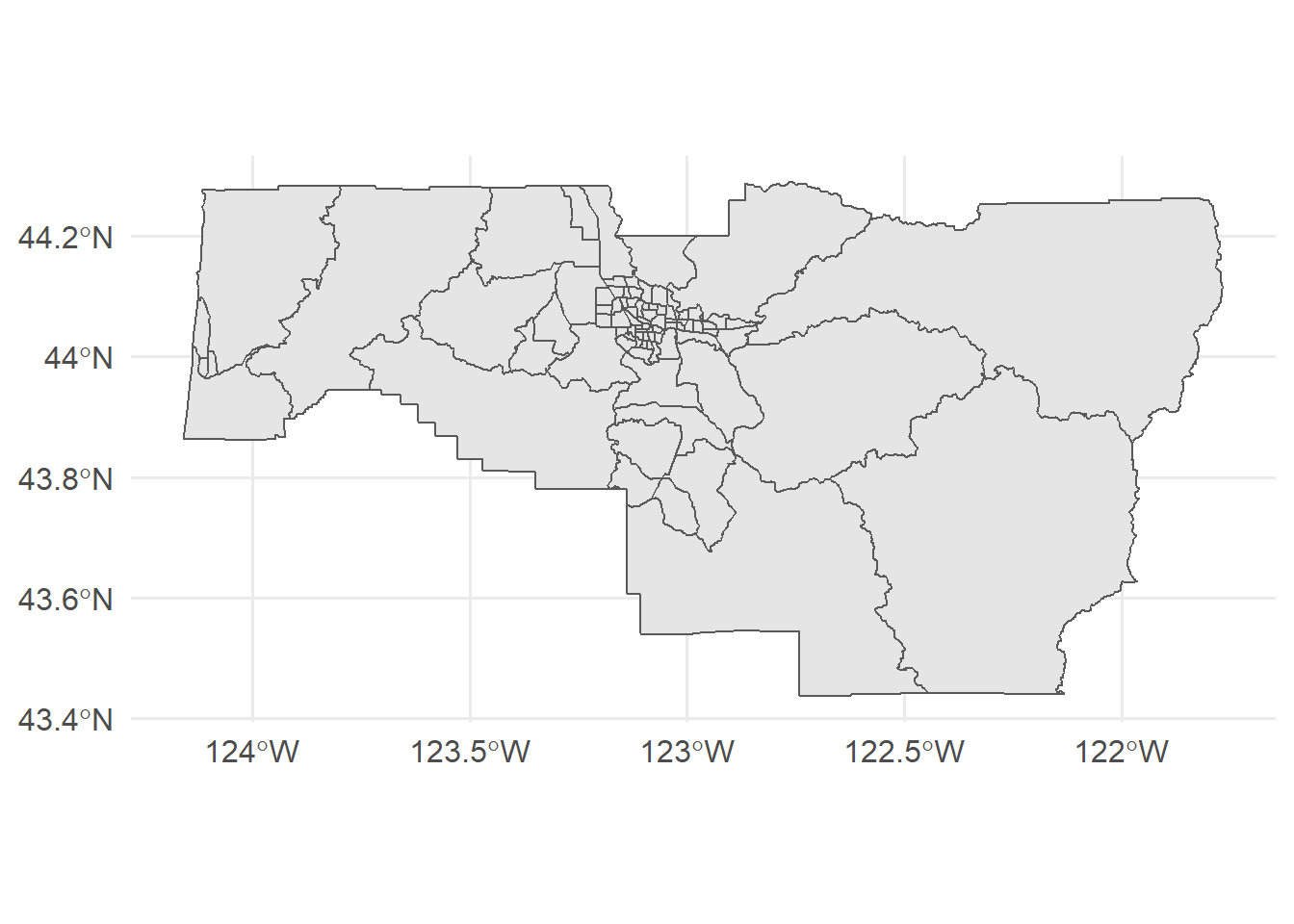
ggplot(lane) +
  geom_sf()
But what we really want to do is understand the distribution, or evenness, of people who identified as Hispanic versus White. So let’s first calculate
lane <- lane %>%
  mutate(a_i = hispE/sum(hispE),
         b_i = whiteE/sum(whiteE),
         diff = a_i - b_i)

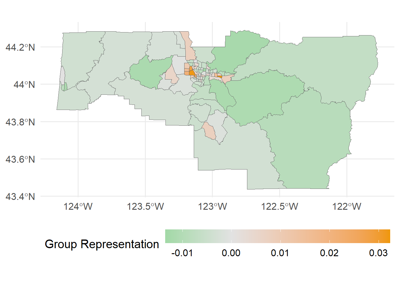
ggplot(lane) +
  geom_sf(aes(fill = diff), size = 0.1, color = "gray40") +
  scale_fill_continuous_diverging(name = "Group Representation", palette = "Green-Orange")
In the map above, positive values indicate areas where people who identify as Hispanic are over-represented, relative to the overall population of people who identify as Hispanic in the county. Similary, green values indicat areas where people who identify as Hispanic are under-represented.
We can calculate the overall segregation for lane county by summing the absolute values for all differences, and multiplying this value by 1/2.
1/2*sum(abs(lane$diff))## [1] 0.2758299As we see, Lane county is not tremendously segregated, but approximately 29% of people would have to move to achieve full evennness.
We can verify that our answer is correct using the seg package
library(seg)## Loading required package: splibrary(sf)## Linking to GEOS 3.8.0, GDAL 3.0.4, PROJ 6.3.1lane %>%
st_drop_geometry() %>% # drop the geometry column
select(hispE, whiteE) %>% # select only the columns we need
dissim(data = .) %>% # estimate %>%
pluck("d") # pull just the non-spatial d## [1] 0.2758299Success!
But what if we wanted to calculate the spatial version? We have everything we need, but we do have to do a bit of reformatting.
sp <- lane %>%
  select(hispE, whiteE, geometry) %>%
  drop_na() %>%
  as_Spatial()

spseg(sp)
##
## Reardon and O'Sullivan's spatial segregation measures
##
## Dissimilarity (D) : 0.0285
## Relative diversity (R): -0.0368
## Information theory (H): -0.0278
## Exposure/Isolation (P):
## hispE whiteE
## hispE 0.10029620 0.8997038
## whiteE 0.09937723 0.9006228
## --
## The exposure/isolation matrix should be read horizontally.
## Read 'help(spseg)' for more details.As you can see, we now have a pretty different measure of dissimilarity, indicating very little segregation in Lane County.
Looking across the whole state
Quickly, we may want to continue with this but look beyond Lane County. We could calculate segregation for the entire state, or by county. Let’s do the first with the non-spatial index, and the second using the spatial index.
Non-spatial \(d\)
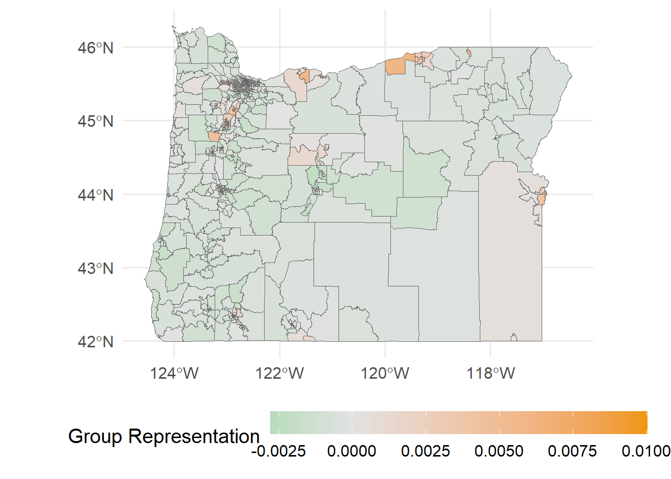
or_tracts %>%
  mutate(a_i = hispE/sum(hispE),
         b_i = whiteE/sum(whiteE),
         diff = a_i - b_i) %>%
  ggplot() +
  geom_sf(aes(fill = diff), size = 0.1, color = "gray40") +
  scale_fill_continuous_diverging(name = "Group Representation",
palette = "Green-Orange") 
And we can get the overall estimate for the state
or_tracts %>%
  st_drop_geometry() %>%
  select(hispE, whiteE) %>%
  dissim(data = .) %>%
  pluck("d")
## [1] 0.3731365So overall the state as a whole is slightly more segregated than Lane County.
Lastly, let’s calculate the segregation for each county. We’ll use the spatial measure this time.
First, we’ll wrap the estimation into a function, which will make looping through the counties a bit easier
estimate_d <- function(county_data) {
  # convert data to spatialDataFrame
  spd <- county_data %>%
    select(hispE, whiteE, geometry) %>%
    drop_na() %>%
    as_Spatial()

  # fit segregation model
  sp_m <- spseg(spd)

  # extract d
  sp_m@d
}
Let’s just test it quickly on Lane County
estimate_d(lane)## [1] 0.02849925Great! Now we can loop it through all the counties.
by_county <- split(or_tracts, or_tracts$county)

county_seg <- tibble(county = names(by_county),
                     d = map_dbl(by_county, estimate_d))
county_seg
## # A tibble: 36 x 2
## county d
## <chr> <dbl>
## 1 Baker 0.0390
## 2 Benton 0.00702
## 3 Clackamas 0.00907
## 4 Clatsop 0.0158
## 5 Columbia 0.0105
## 6 Coos 0.0303
## 7 Crook 0.0647
## 8 Curry 0.0840
## 9 Deschutes 0.0181
## 10 Douglas 0.0141
## # ... with 26 more rowsIf we want to actually map these estimates, we have to first get county geographies. There’s lots of ways to do, but let’s stick with tidycensus and just request any variable.
or_counties <- get_acs("county",
              variables = c(hisp = "B03002_012"),
              state = "OR",
              output = "wide",
              geometry = TRUE) %>%
  mutate(county = gsub(" County, Oregon", "", NAME))

or_counties %>%
  left_join(county_seg)
And now we can plot it!
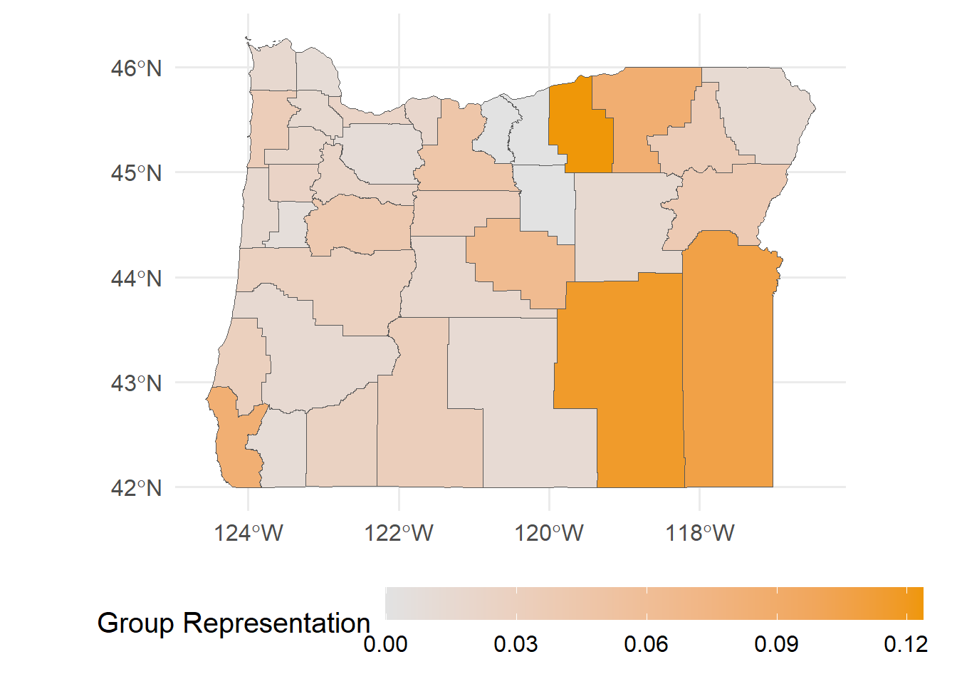
or_counties %>%
  left_join(county_seg) %>%
  ggplot(aes(fill = d)) +
  geom_sf(size = 0.1) +
  scale_fill_continuous_diverging(name = "Group Representation",
                                  palette = "Green-Orange")
## Joining, by = "county"
And we get a fairly different representation. But note that the comparisons here are different. In the map before this one, we were looking at the representation of people identifying as Hispanic within a given tract relative to the statewide population. Here, we’re looking at essentially the same thing but using county populations as the comparator, so we can get a sense of the between-county variance in segregation.
That’s it for now! Please get in contact with myself or another member of the research team if you have any questions.